Each fall, MinneAnalytics invites midwest undergraduate and graduate teams to participate in a challenge to analyze and present on a real-world dataset. This year, MinneMUDAC 2017 provided participants with HIPAA-compliant datasets on 40k type II diabetes patients, with anywhere from 0-36 months of data for each patient. The dataset included four tables on hospital, pharmacy, and medical claims, plus an additional set on laboratory results. Each observation corresponded to a specific medical claim, and had variables on provider data, diagnosis data, drug class, etc. In addition to the 0-36 months of data, 12 months of a target dataset sometime in the future was provided. The task was now set for graduate and advanced undergraduate participants to use this data to build a model which can predict the top 6,000 highest cost patients in the next 12 months, to be compared against a holdout dataset of the actual top 6,000 highest cost patients for evaluation.
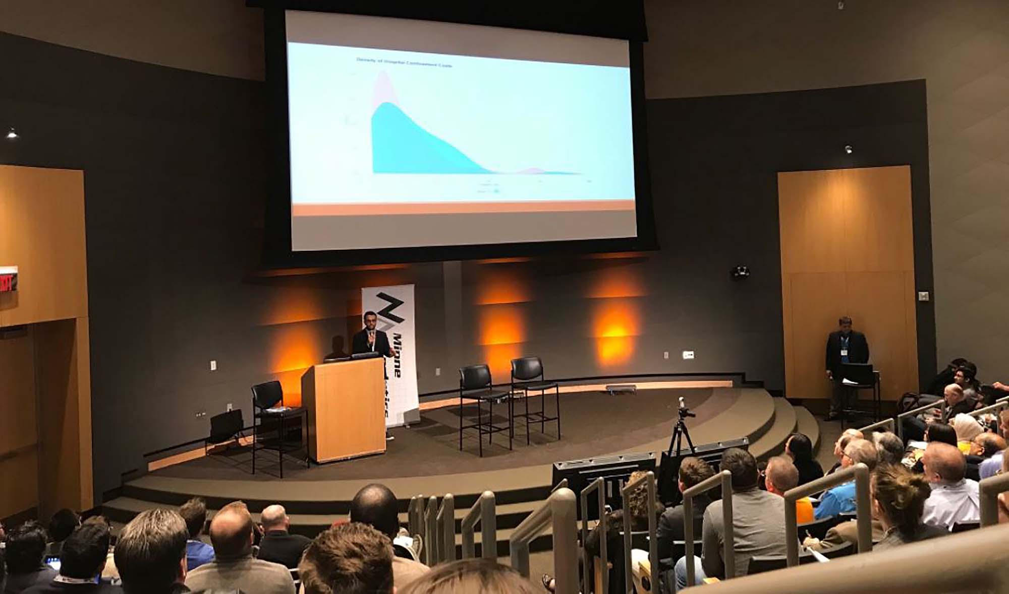
My role in this began when a member of my Qik-n-Ez team asked if we wanted to participate. I agreed, but weeks later, I had been the only one who'd done any work. One week before presenations, my teammates dropped out, leaving just me and my work. When requesting to our supervisor that we resign, he suggested I go and present what I have. By that time all I had was a mediocre model, so I threw together some visualizations in a few hours and went to present what I had alone. Turns out, out of hundreds of people and four rounds of judging, that was enough to get my "team" into the finals and present in front of 300+! I present my findings. Additionally, my presentation can be downloaded here. Unfortunately, due to data usage restrictions, I cannot present code.

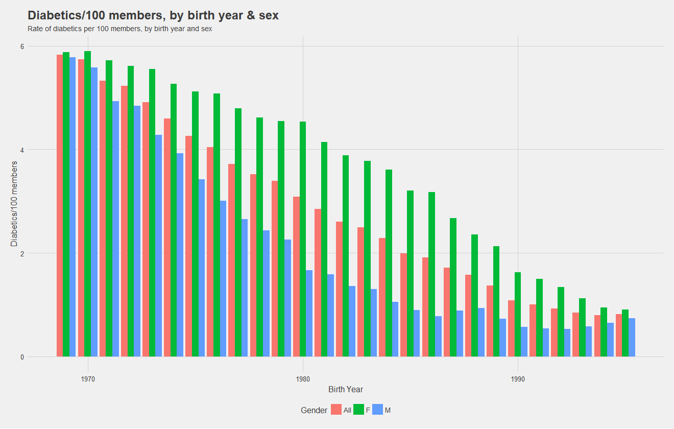
Before building models, it's necessary to understand the data! Below, I show the rate of diabetics, ie number of diabetics per 100 individuals with the insurance by birth year and split by sex. Notice that females have a higher rate overall, and the rate for males drops drastically as age decreases. Notice also, that males see in increase in rate for the youngest cohorts. During the presentation, I was asked if I believe women are at higher risk of diabetes. My response was simply that the data shows a higher rate, there could be confounding variables, but the higher rate is there.
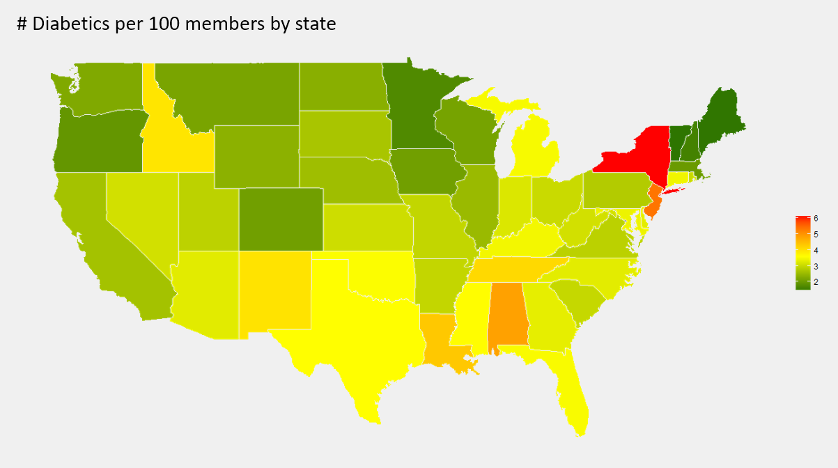
Now, we look at the rate of diabetics per 100 members by state. It appears that the south generally has a higher rate than the north and west, and New York has an especially high rate of diabetics.
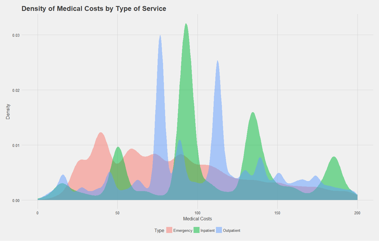
After exploring rates, let us move on to looking at the claims data itself. Note, for all the following analysis, trauma and pregnancy related claims were removed from the data with the help of some regular expressions, as these data are independent of the illness. Below, I show a density plot of outpatient, inpatient, and emergency claims costs for type II diabetics. A high density at a certain point indicates many claims were filed at that price point. Key takeaways from this are that emergency room visits have quite a range of costs, while inpatient and outpatient claims have four and two common costs respectively. These peaks likely correspond to specific procedures that diabetics commonly undergo.
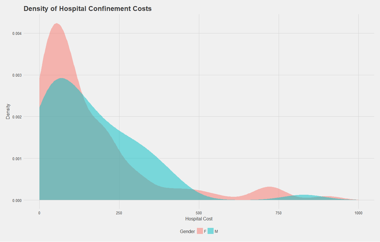
Let's focus in on the density of hospital confinement costs by gender. Below, we see a density plot of each claim, split by sex. Males generally have higher costs, and both males and females see a characteristic bump at the higher end of the spectrum, possibly corresponding to longer stays or surgical procedures.
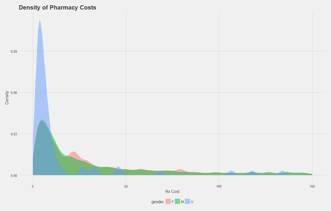
Let's do the same, but for pharmacy costs. Here, some patients had an undefined gender as well. All that's really to take away is there's a similar distribution between sexes.

Now that some exploratory characterization of the data has been done, we can begin to build the model. Again, the task is to predict the 6,000 highest cost patients for the next year. The training data given consists of 0-36 months of claims data, and 12 months of claims data sometime in the future. Therefore, we can use the 0-36 month "initial" dataset for input variables, and use the 12 month dataset just to tabulate insurance costs, using this as target data. Therefore, each patient in the initial dataset will be mapped to a target cost in the 12 month dataset. We can then form a 70:30 split on all the users for training and testing a model.
Notice, this prediction task is either a classification problem, or a numeric prediction problem depending how you see it. I approached it as numeric prediction, predicting the cost in the next year for each patient and taking the top 6,000. I did approach this with classification techniques, but results were quite poor.
The data, as given, was very messy and huge, about 1 gigabyte in total with about 14 million entries. As such, I performed all my initial analysis, wrangling, and model testing with a smaller, sampled dataset before passing all of the data through the pipeline for final results. To get it in a form I could work with I went through the following procedure:
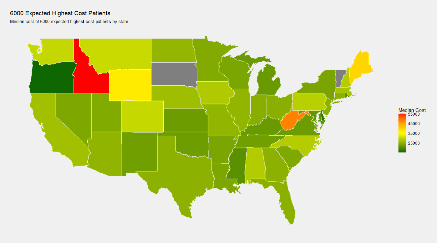
As one preliminary visual, I wanted to see the median cost per state in the 12 month target data for patents expected to become highest cost, which I've shown below, note the state dependence.
Similar to the above image, I also wanted to see the state dependence of median cost in the 0-36 month dataset of people who will stay high cost.
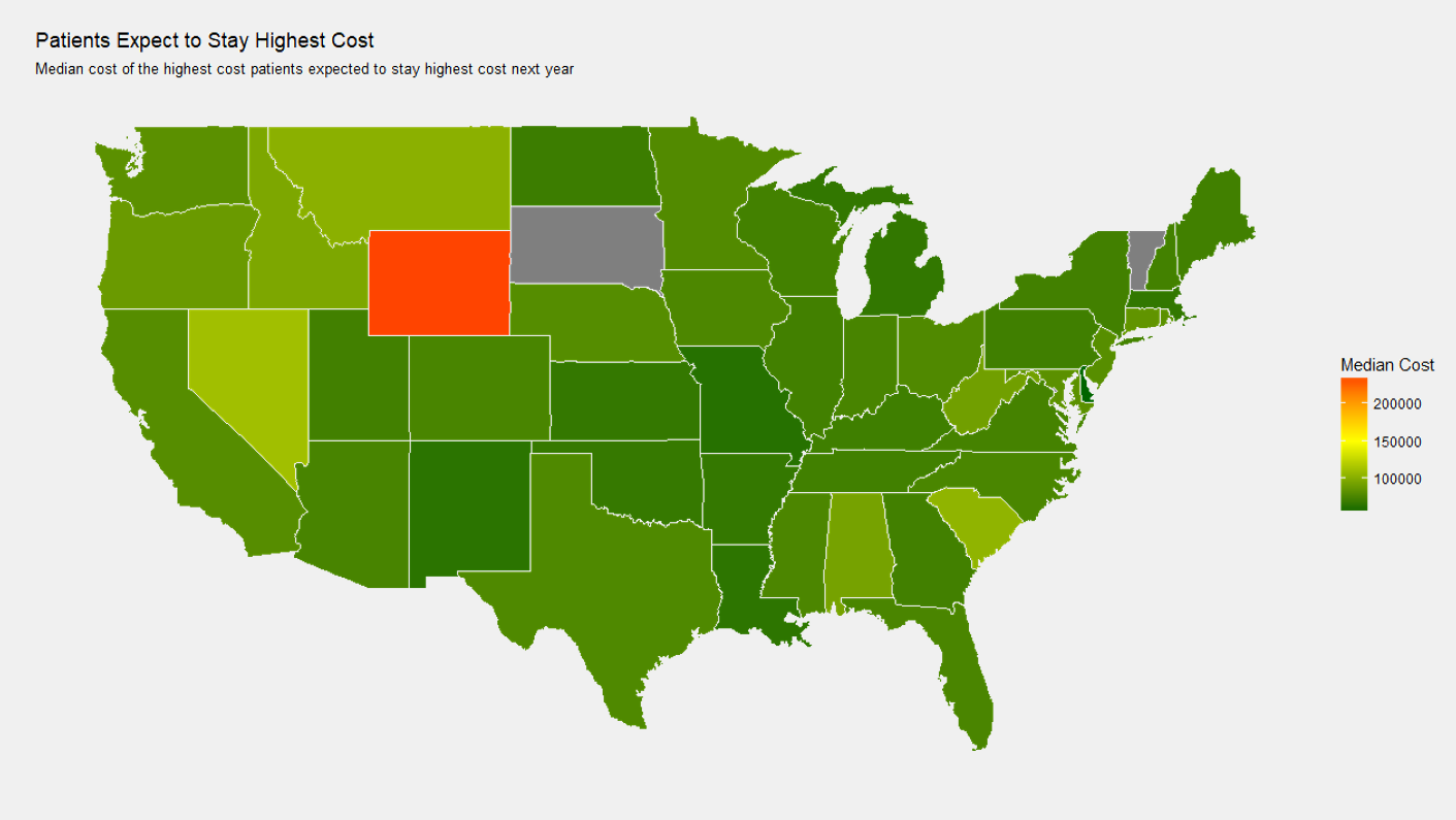
Note that one thing I did not consider in the state dependence graphs is the numeber of people with data in each state. Two states in each have zero high cost patients; it's possible the median cost for some patients is driven up by just one or two especially expensive patients. Sadly, I did not have time to investigate this, but either way, state dependence is apparent.
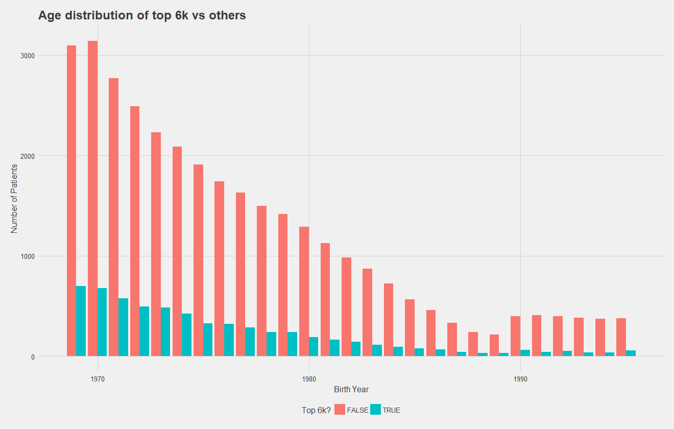
Below, I show the age distribution of the top 6,000 high cost and non-high cost patients, which number of patients on the y axis. To improve this graph, I should have normalized by total number of patients to make differences in the distribution more apparent, but it's clear that distributions are relatively similar. While this may suggest age is not a significant predictor, regression models have demonstrated it to be so. Notice that in both graphs however, there is an increase in younger patients.
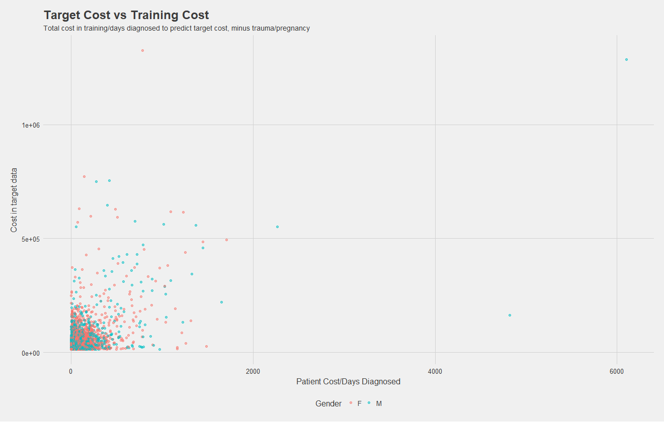
Now, I've simply plotted total costs per patient in the 0-36 month dataset vs costs in the target dataset. While there might not be much of a relationship, this "naive" model alone of grabbing the top 6,000 from the initial dataset to predict the top 6,000 in the future has an accuracy of about 50%! I included this as a factor in my models, and it certainly was the most significant predictor for every group, but feature importance analysis such as that provided in XGBoost would be necessary to know for sure.
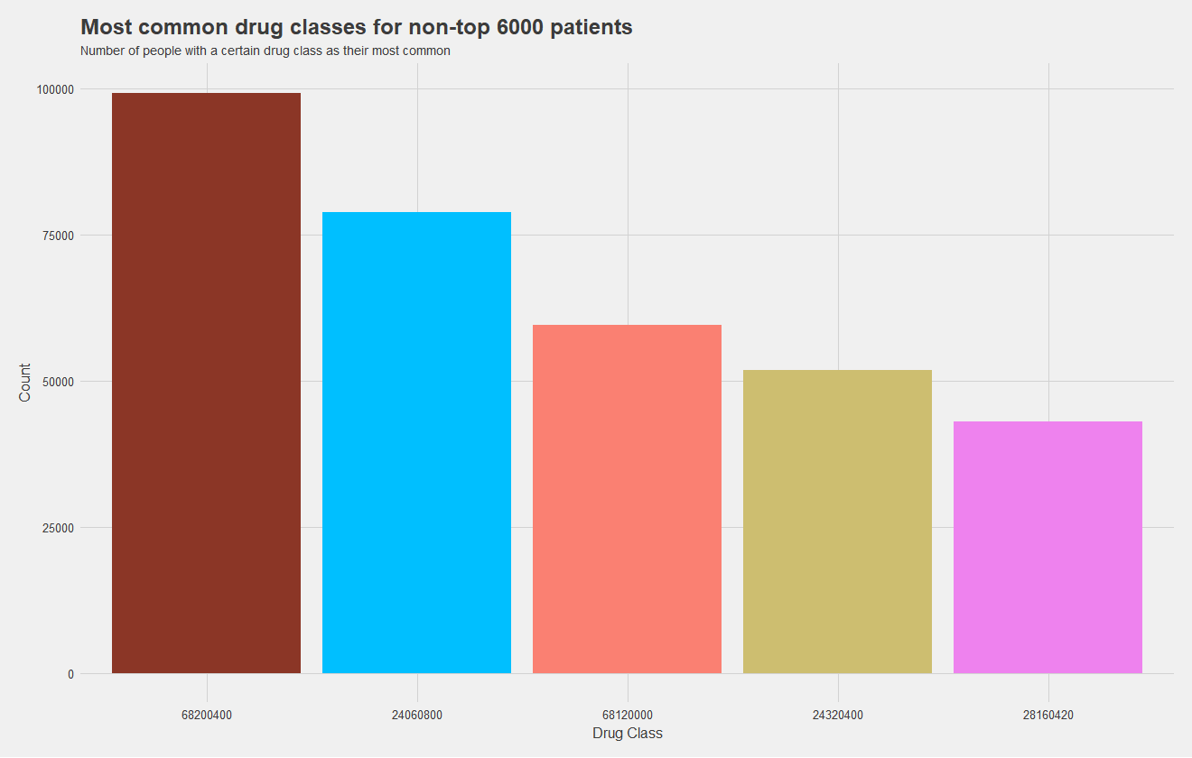
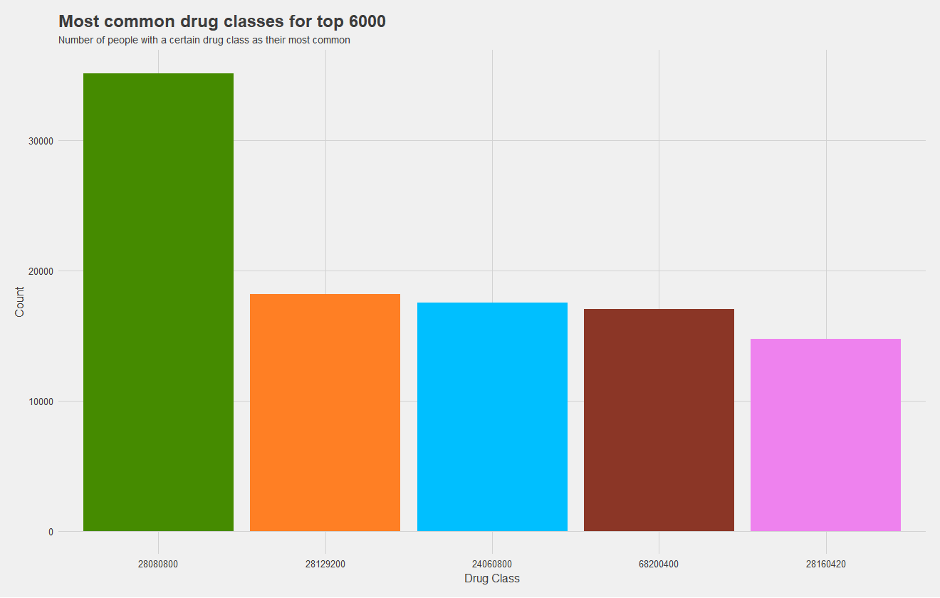
Now, one of my most significant findings, which I sadly did not have time to incorporate into a model, was the high cost dependence on drugs. I attempted to incorporate the most common type of drug a patient uses as a predictor, but there were far too many levels to train the mode effectively and did not serve as a great predictor. What I should have done, is keep the five most common levels and group the rest into "other." This would allow me to train a model more effectively, and as you may notice from the figures below, drug class is pretty significant.
The top graph shows the most common drug classes amongst non-high cost patients, and the bottom graph shows most common drug classes amongst high cost patients. Height indicates the number of patients with that drug class as their most common one, and drug classes are color coded, matching between graphs. It's quite apparent that high cost patients use an entirely different set of drugs which makes them high cost. In fact, only two drugs, the maroon and pink, are shared between groups. The green has near double the prevalance as the next most common for the high cost set.
Now that we've picked out some significant predictors, it's time to test models. I attempted Naive Bayes, random forests, neural nets, among others. I found an M5' model tree to work the best. A model tree can be described as a regression tree, with a linear regression model at each leaf. As for predictors, it's awful practice but I threw in everything I thought would help. I did not check for correlation between predictors or the significance of each, but I was one person with four tough classes and little time. In the end, I predicted on:
At the end of the day, the model yielded 53% correct in a separate testing dataset, with 69% correlation and a $7435 mean average error (MAE). While the MAE may seem large, keep in mind some patients' costs soared into the millions, so outliers can impact the MAE significantly. Below, I show a plot of predicted vs target values.
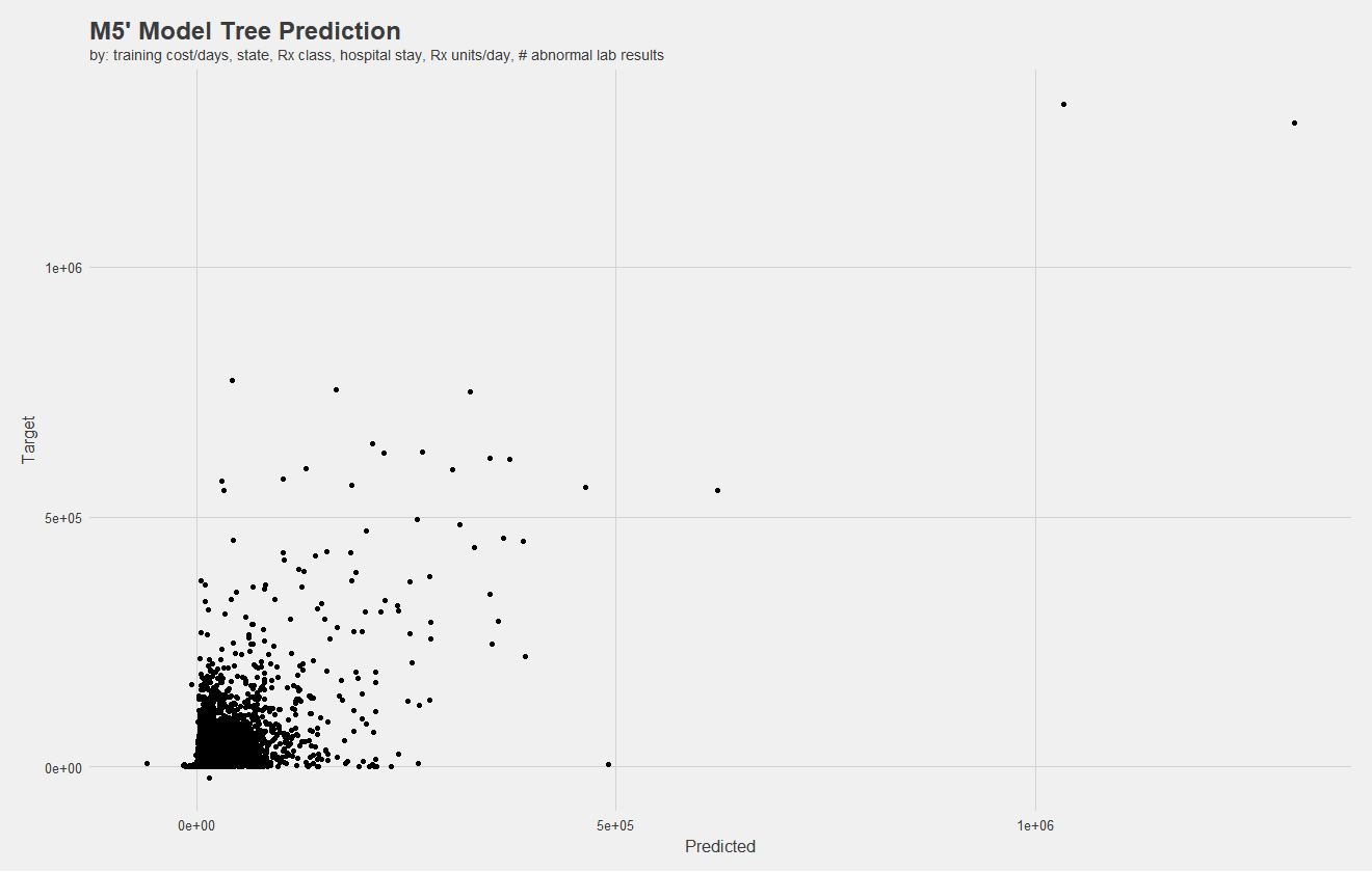
Notice, there are negative values. Negative costs in claims indicate the reversal of a charge, meaning there should be two claims with the same cost but opposite signs. However, there are some mistakes, and negative claims exist without a positive counterpart. I attempted to remove these, however, my computer could not process them in a reasonable amount of time.
While my model performed competetively against even the best teams, there's a lot of work that could be done. A better analysis of feature importance is in order, in addition to more summary statistics. With such a vast array of variables to explore, principle component analysis should be in order. Additionally, I would have like to explore this further as a classification problem.
Of course, throughout all of this I simply did not have nearly enough time to explore more, as one individual. So, another takeaway is that teamwork makes a difference. Team commitment can allow for a better distribution of the workload!
Unfortunately, due to data usage restrictions, I can't work on this project further, but I am quite happy with the progress I had made and where it got me. It was certainly a learning experience. Thanks for reading!